HEIMO ZOBERNIG – this not this
EI ARAKAWA-NASH – Cologne of the Maghreb (Bodyphilia Song)
May 29th 2026 – Jul 31st 2026


Exhibition Text
FAKING THE REAL
Since the 1980s, the ‘anti-essentialist system’ practiced by Heimo Zobernig has functioned as a consistently applied negative dialectic in his art. Within this, Zobernig regularly explores the question of the manipulation of realities.
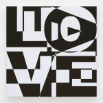
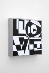
In untitled (LOVE/HATE) for example, the use of extra-bold Helvetica letters—a font typical of modernism—serves to appropriate and reinterpret Robert Indiana’s painting (LOVE, 1966), for which he had chosen a 19th-century typeface: Clarendon Bold. In 1987, Zobernig’s motif was then politically adopted by the Canadian group General Idea for an ‘Art against Aids’ campaign and adapted into an AIDS emblem.
Since 1986, Heimo Zobernig has been using the sans-serif typeface Helvetica for catalogue and poster designs. Once celebrated as an icon of the Swiss Style, Helvetica increasingly lost its prestige during the 1980s. Among typefaces, it became something like chipboard among furniture woods. Its form appears so neutral that the viewer forgets that it is a typeface. From 1990 onwards, Zobernig began to label his exhibitions consecutively from A to Z using Helvetica letters. In 1993, he designed a poster for a group exhibition in orange, brown, grey, black and white, in which the word REAL appeared for the first time. A year later, the first REAL paintings were created in the same colours.
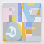
Initially, four letters R-E-A-L in a sans-serif typeface filled the entire canvas, dividing it into four equally sized panels. Zobernig composed the letters from a fixed arrangement of differently colored geometric shapes.
Step by step, Zobernig expands the color palette of the REAL paintings and eventually adds the word EGAL (meaning ’whatever’) which now fills the canvas to the same extent as REAL. The words appear to be written one inside the other; their meaning is negated. A new interpretative starting point of complex construction has been reached.
Later paintings also follow the same template; differing only in their color combinations. Zobernig leaves the interpretation of this mosaic to the viewer. Upon a closer look the circles and rectangles form further letters turned upside down. From the world-assuring R-E-A-L, arbitrariness ultimately emerges once more: E-G-A-L.
The composition of the spatial relationships and colour tones on the canvas results in a work that is both gently humorous and aesthetically pleasing, without being purely functional or purely visual.
As Helmut Draxler notes, the image here literally names a situation without fulfilling it.
As seen in the previous gallery exhibition, SPLENDID PLAYGROUND, Ei Arakawa-Nash—who is representing Japan at this year’s Venice Biennale—has also collaborated with Nikolas Gambaroff to create a play on letters, known as ‘Two-Alphabet Monograms’, as a dysfunctional written and spoken language.
Similar to Heimo Zobernig’s method, this involves constantly exploring the productive and interpretative possibilities of traditional artistic practices. Through their deliberate engagement with their respective media, both artists raise questions about process, institutional context and performativity.
As Ei Arakawa-Nash does not produce paintings himself, he is constantly reliant on the works of other artists, which leads to a kind of duplication of these within his work, whereby he continually slips into other identities. In his work Cologne of the Maghreb (Bodyphilia Song) (2016), created for his exhibition at the Museum Ludwig, he referenced the Cologne painter Michael Buthe (1944–1994), with whose works he feels a strong conceptual and identity-based connection. He has thus created an installation featuring a singing LED painting that explores issues of identity and body politics.
In 2018, Arakawa-Nash explored the performative potential of LED paintings in the work Harsh Citation – Harsh Pastoral – Harsh Münster, Head of Installation at the Kunstverein Düsseldorf, proposing an alternative interpretation of performance art. Eight LED works were subjected to astrological analyses by the American artist Sarah Chow, based on their respective times and places of birth. Among other works, Tony Conrad’s performance 7360 Sukiyaki (1973) was literally addressed as a ‘person’ in Arakawa-Nash’s multimedia LED work including its respective psychological idiosyncrasies. How do performances think and feel?
Heimo Zobernig (*1958, lives in Vienna)
Ei Arakawa-Nash (*1977, lives in Los Angeles)
Ausstellungstext
FAKING THE REAL
Seit den 80er Jahren wirkt das von Heimo Zobernigs praktizierte „anti-essenzialistische System“ wie eine künstlerisch konsequent praktizierte negative Dialektik. Regelmäßig widmet sich Zobernig dabei der Frage der Manipulation von Realitäten.
In ohne Titel (LOVE/HATE) beispielsweise, dient die Verwendung von extra fetten Helvetica-Buchstaben als typische Schriftart der Moderne, der Aneignung/Neuinterpretation von Robert Indianas Gemälde (LOVE, 1966), der dafür eine Schrift des 19. Jahrhunderts gewählt hatte: Clarendon Bold. 1987 wird Zobernigs Sujet dann von der kanadischen Gruppe General Idea für eine „Art against Aids“-Kampagne politisch aufgegriffen und zu einem AIDS-Emblem adaptiert.
Seit 1986 verwendet Heimo Zobernig für Katalog- und Plakatentwürfe die serifenlose Schrifttype Helvetica. Einst als Ikone des Swiss Style gefeiert, verlor Helvetica im Laufe der 80er Jahre zunehmend an Prestige. Unter den Schrifttypen wurde sie zu so etwas wie die Pressspanplatte unter den Möbelhölzern. Ihre Form wirkt so neutral, dass der Betrachter vergisst, dass es sich um Schrift handelt. Ab 1990 beginnt Zobernig seine Ausstellungen von A-Z fortlaufend mit Helvetica Buchstaben zu bezeichnen. 1993 entwirft er für eine Gruppenausstellung ein Plakat in den Farben Orange, Braun, Grau, Schwarz und Weiß, indem erstmals das Wort REAL erscheint. Ein Jahr später entstehen in den gleichen Farben die ersten REAL Bilder.
Ursprünglich nehmen vier Buchstaben R-E-A-L als serifenlose Schrift die gesamte Bildfläche ein und unterteilen diese in vier gleich große Paneele. Zusammengesetzt hat Zobernig die Lettern aus einer fixen Anordnung verschiedenfarbiger geometrischer Formen.
Stück für Stück erweitert Zobernig die Farbskala der REAL Bilder und fügt schließlich das Wort EGAL hinzu, das nun in gleichem Ausmaß wie REAL die Leinwand füllt. Die Worte erscheinen ineinander geschrieben, ihre Bedeutung hebt sich auf. Ein neuer, interpretatorischer Nullpunkt von komplexer Konstruiertheit ist erreicht.
Auch spätere Gemälde folgen jeweils ein und derselben Schablone, nur die Farbkombination unterscheidet sich. Die Lesart dieses Mosaiks überlässt Zobernig dem Betrachter. Schaut man genau hin, ergeben die Kreise und Rechtecke weitere, auf den Kopf gestellte Buchstaben. Aus dem weltversichernden R-E-A-L schält sich so am Ende wieder Beliebigkeit: E-G-A-L.
Die Komposition der räumlichen Beziehungen und Farbtöne auf der Leinwand ergibt insgesamt ein Werk, das gleichermaßen leicht komisch und ästhetisch ansprechend ist, ohne dabei rein funktional oder rein visuell zu sein.
Das Bild benennt hier, wie Helmut Draxler anmerkt, einen Sachverhalt buchstäblich, ohne ihn einzulösen.
Wie in der vorhergehenden Galerieausstellung SPLENDID PLAYGROUND zu sehen, entwickelte auch Ei Arakawa-Nash, der im heurigen Jahr Japan auf der Biennale in Venedig vertritt, gemeinsam mit Nikolas Gambaroff ein Spiel mit Buchstaben, sogenannte Two-Alphabet Monograms, als dysfunktionale, geschriebene und gesprochene Sprache.
Heimo Zobernigs Methode verwandt, ist das ständige Austesten von Produktions- und Bedeutungs-möglichkeiten traditioneller künstlerischer Praktiken. Beide Künstler werfen im bewussten Umgang mit den jeweiligen Medien Fragen nach Prozess, institutionellem Kontext und Performativität auf.
Da Ei Arakawa-Nash selbst keine Gemälde anfertigt, ist er stets auf die Werke anderer Künstler:innen angewiesen, was zu einer Art Verdopplung dieser innerhalb seiner Arbeit führt, wobei er ständig in andere Identitäten schlüpft. So hat er sich in seiner Arbeit Cologne of the Maghreb (Bodyphilia Song) 2016 anlässlich seiner Ausstellung im Museum Ludwig auf den Kölner Maler Michael Buthe (1944–1994) bezogen, zu dessen Werken er eine starke konzeptuelle und identitätsmäßige Verbindung empfindet.
So hat er eine Installation mit einem singenden LED-Gemälde geschaffen, das über Identitäts- und Körperpolitiken spekuliert.
2018 testete Arakawa-Nash dann die performativen Potentiale von LED-Gemälden in der Arbeit Harsh Citation – Harsh Pastoral – Harsh Münster, Head of Installation, im Kunstverein Düsseldorf und schlug darin eine alternative Lesart von Performancekunst vor. Acht LED-Arbeiten, wurden dabei von der amerikanischen Künstlerin Sarah Chow astrologischen Analysen in Bezug auf ihre jeweiligen Geburtsstunden, sowie ihre Geburtsorte unterzogen. Dabei wurde unter anderen die Performance 7360 Sukiyaki von Tony Conrad (1973) in Arakawa-Nashs multimedialer LED-Arbeit buchstäblich als „Person“ adressiert – einschließlich ihrer jeweiligen psychologischen Eigenheiten. Wie denken und fühlen Performances?
Heimo Zobernig (* 1958, lebt in Wien)
Ei Arakawa-Nash (*1977, lebt in Los Angeles)